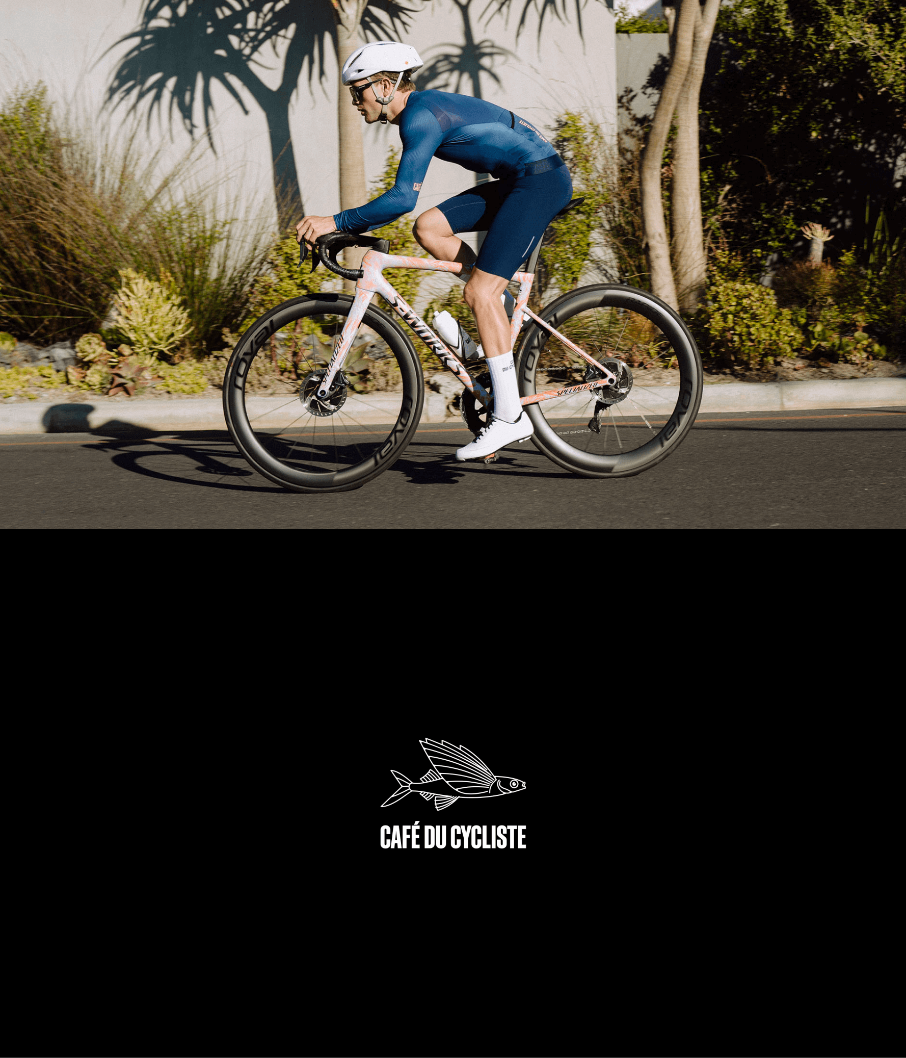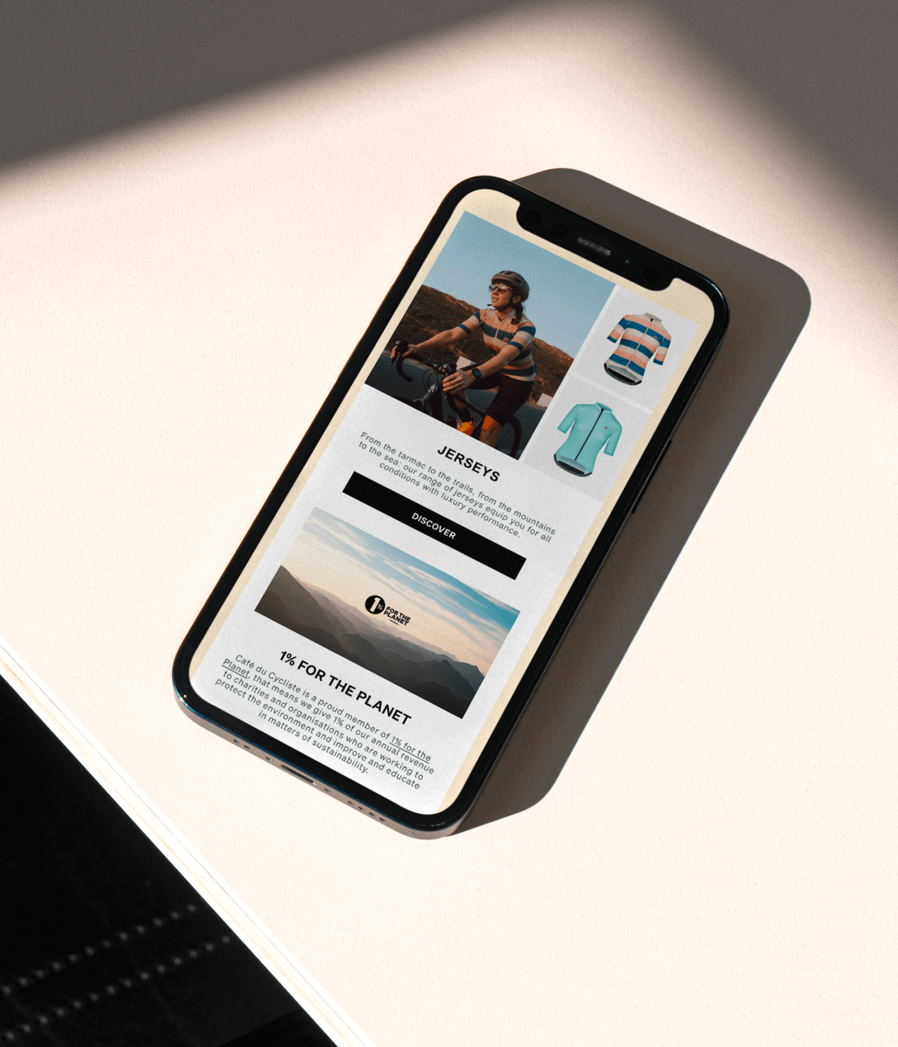
Anchored on the Côte d'Azur, Café du Cycliste is a French premium cycling label dedicated to sharing a passion for cycling and the outdoors.
Role
Email Design
Duration
6 Weeks
About Project
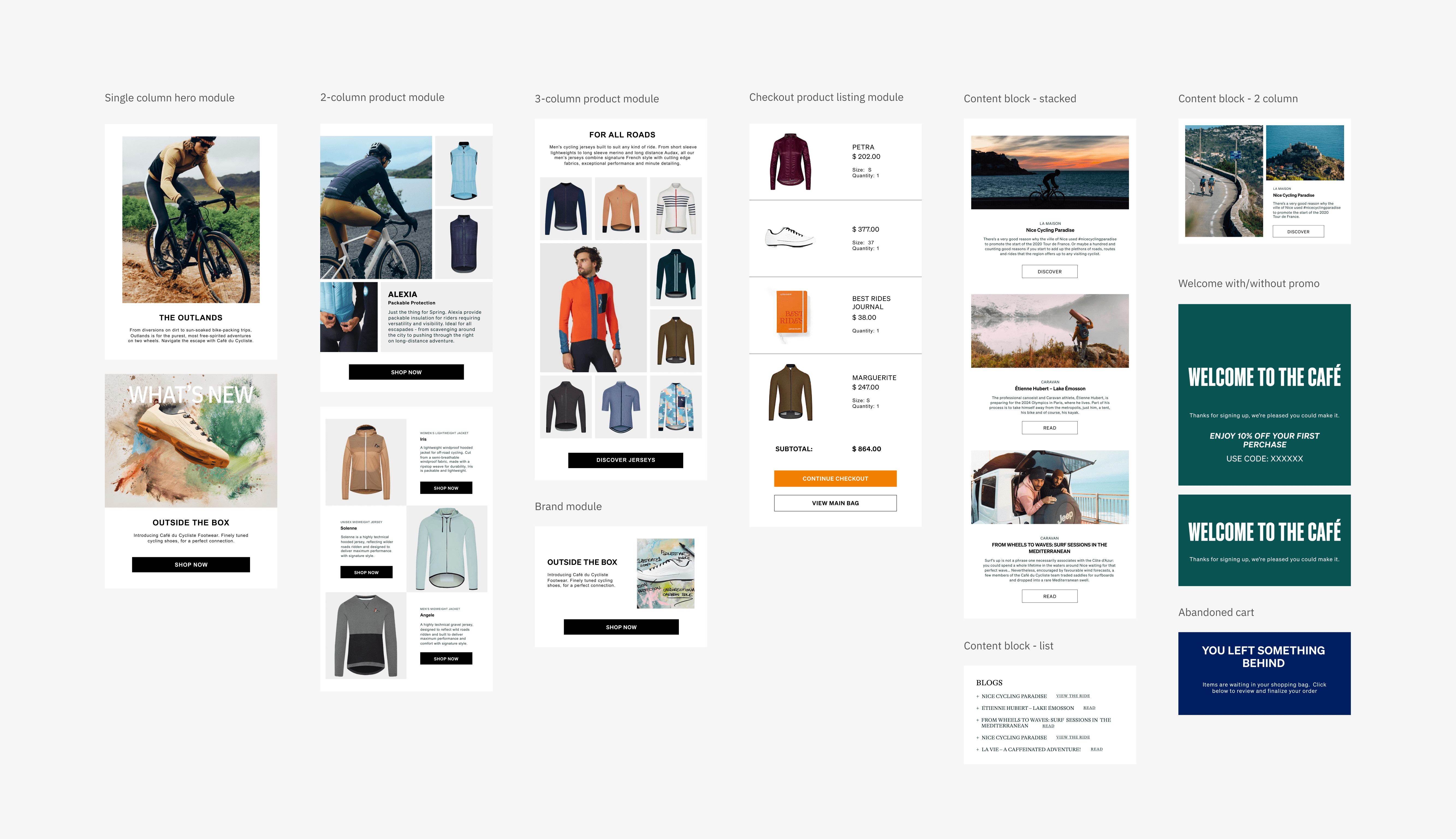
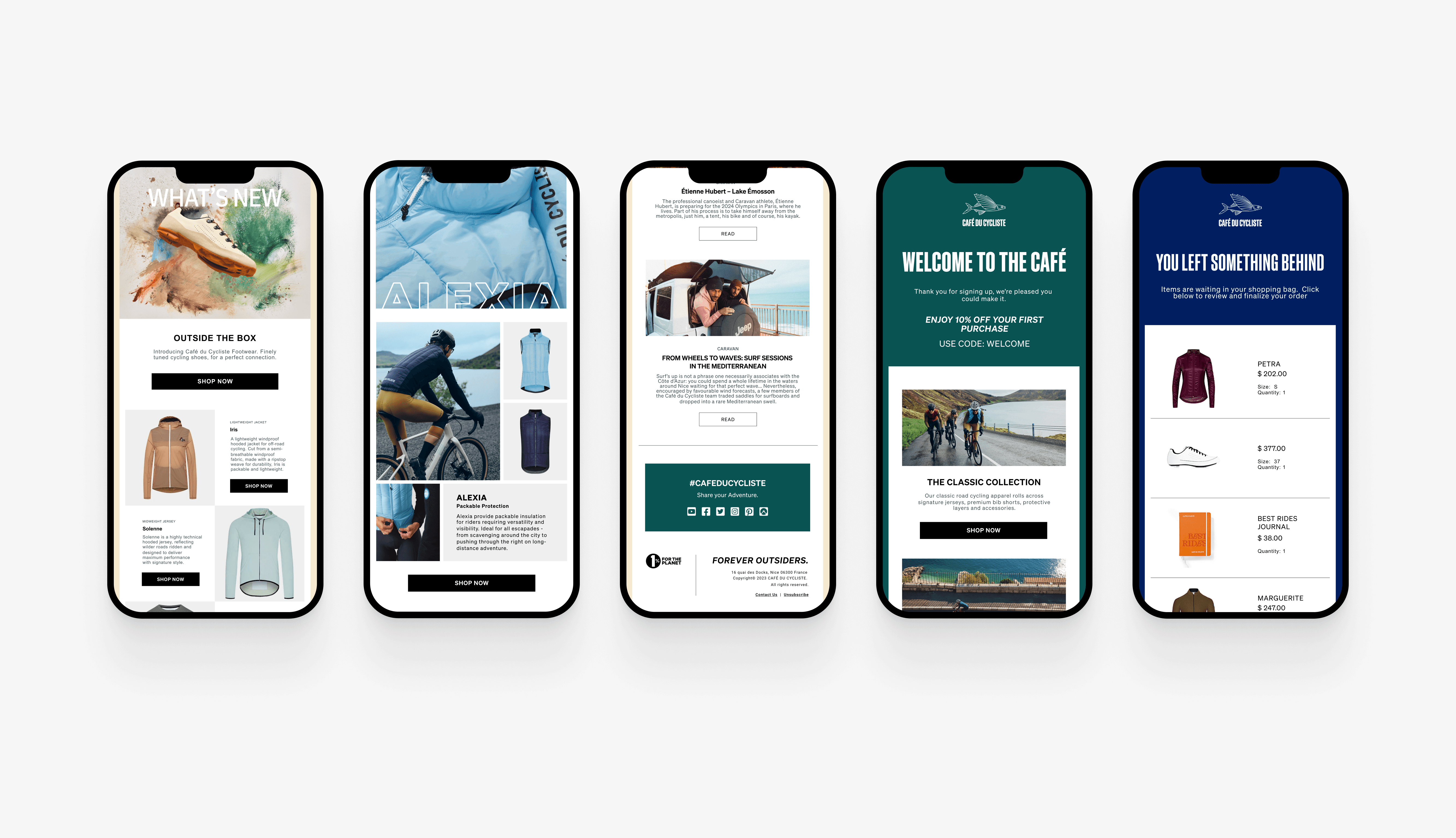
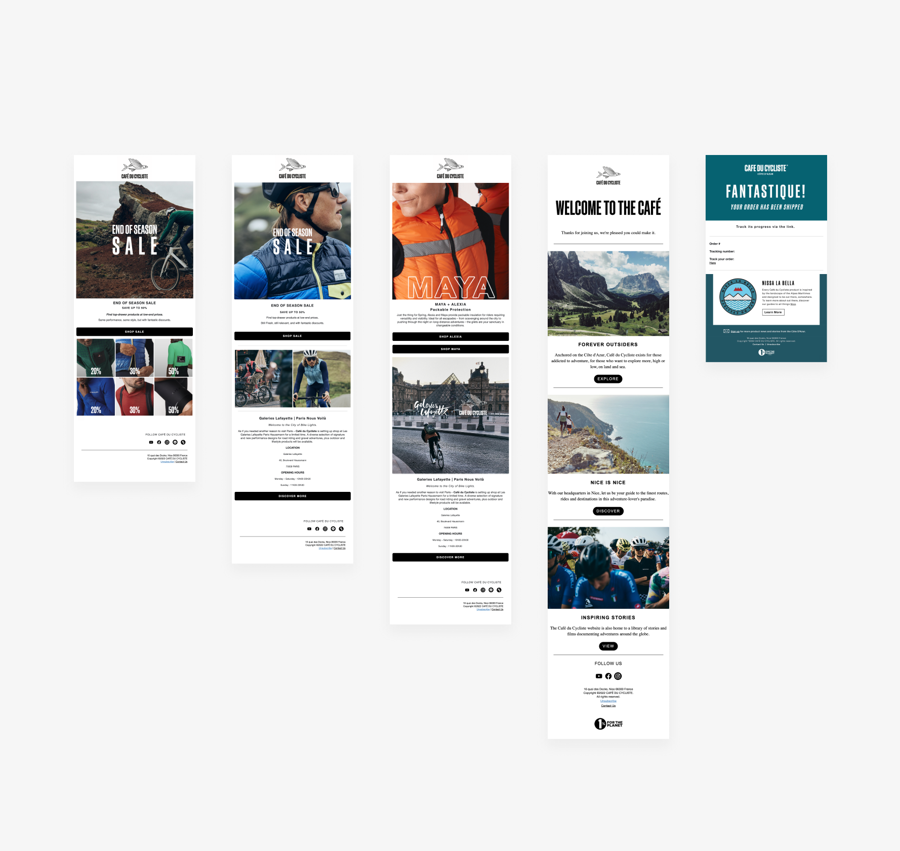
The client requested the creation of memorable and engaging email design templates to build brand loyalty and help increase conversion rates. My role was to establish the overall visual expression for the email design system and ensure design consistency across welcome, abandoned basket, and newsletter templates. A key focus of this project was to capture the essence of the brand and introduce a new seasonal color palette
Design Research
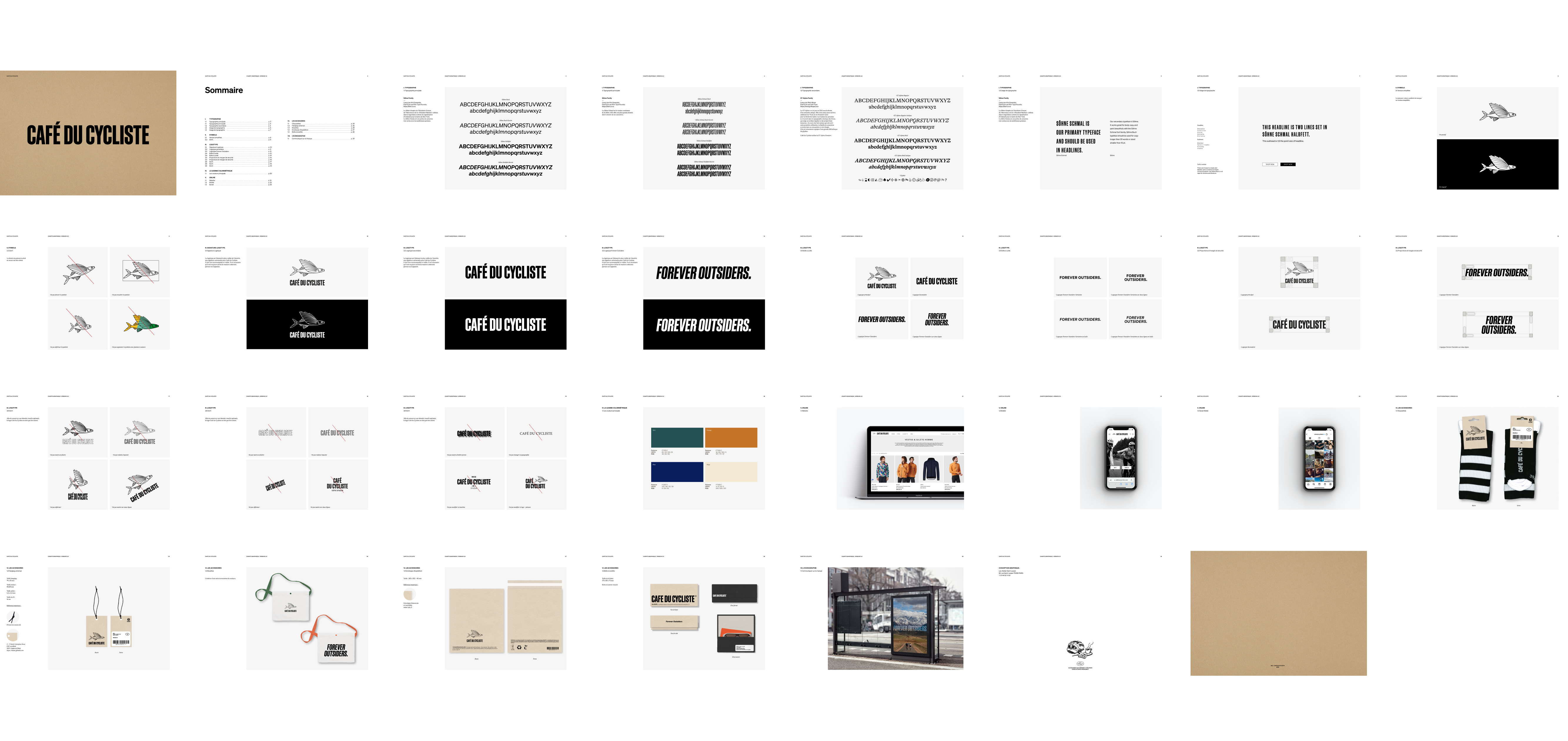
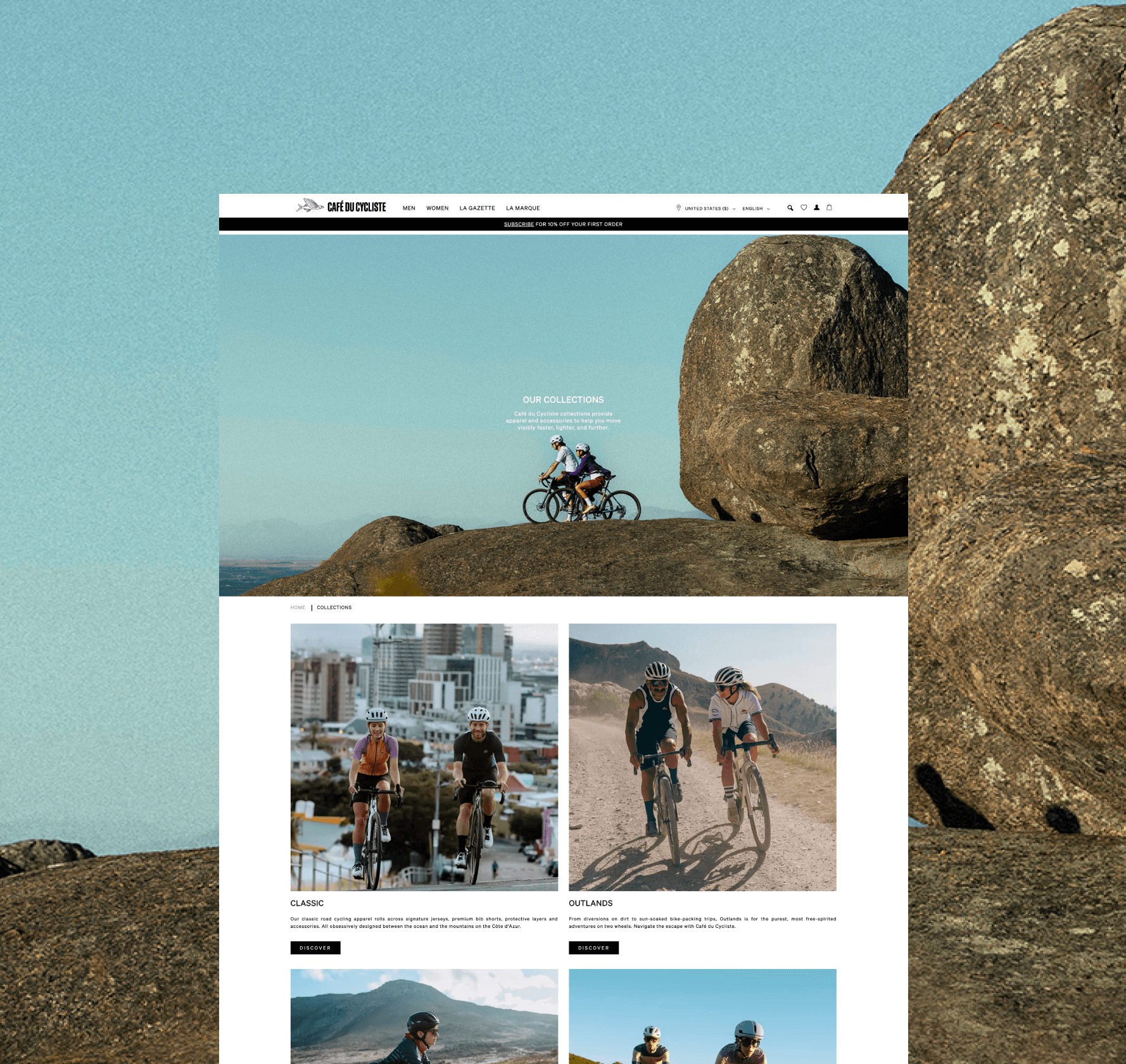
Design research is the backbone of my design approach. Understanding the brand’s visual language and auditing the existing email design system helped identify missed opportunities and shape the art direction. The existing system lacked branding that uniquely identified the email designs as Cafe du Cycliste’s. To address this, I moved away from the minimal monotone approach commonly seen on the company’s website and proposed infusing bold colors with a color block treatment.
Colors

Color Application

Challenges / Design Exploration
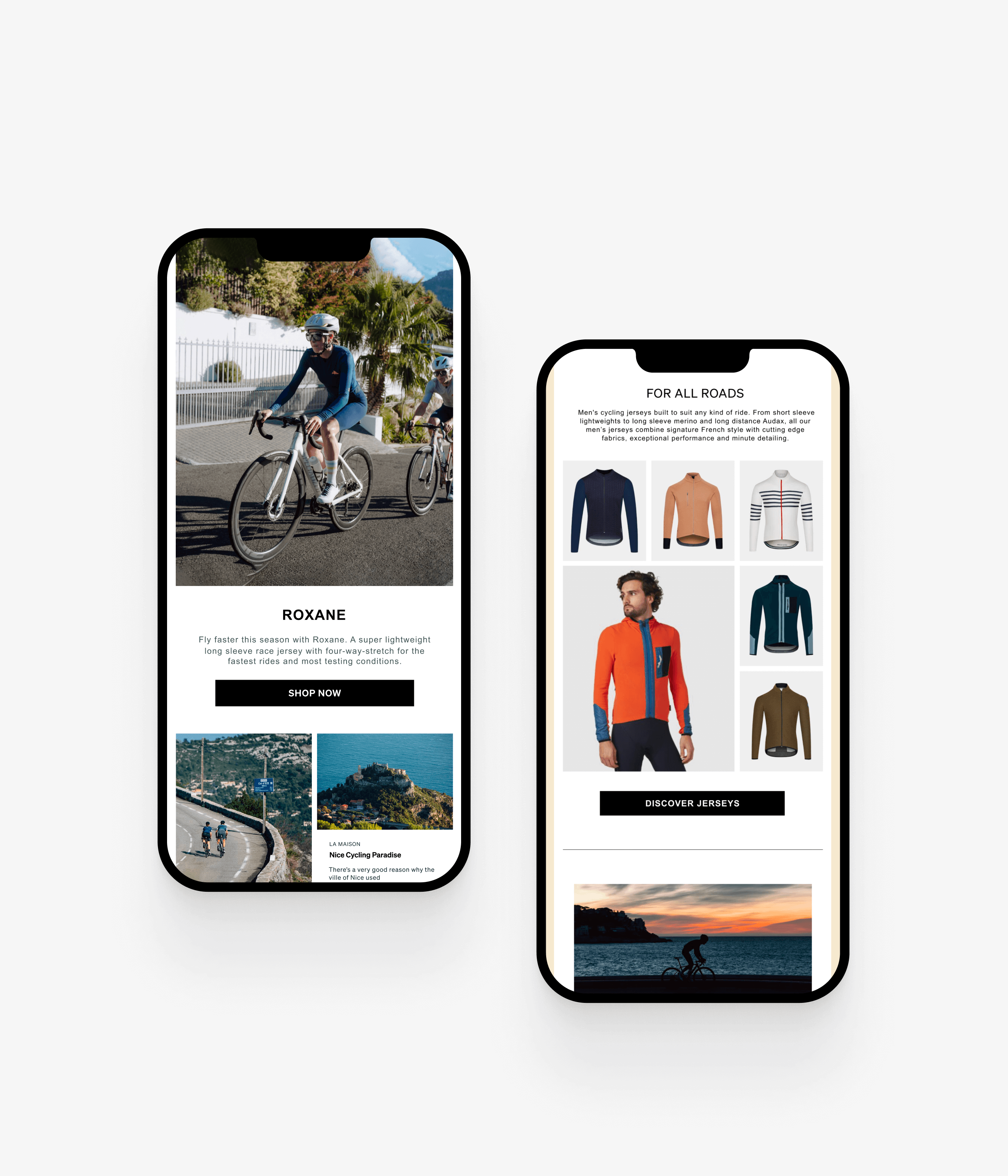
Since the design needed to be built in Klaviyo, I considered any design limitations associated with the platform's technical aspects. Before exploring design options, I experimented with Klaviyo to gain a better understanding of how components behave in mobile viewports and multi-column layouts.
Result
After several iterations, the outcome is a set of bold and youthful email design templates with a hint of sophisticated French flair that elevated the brand's impact and digital presence. Most importantly, the components were built with scalability in mind, allowing for flexibility and the ability to be mixed and matched for different levels of complexity.
