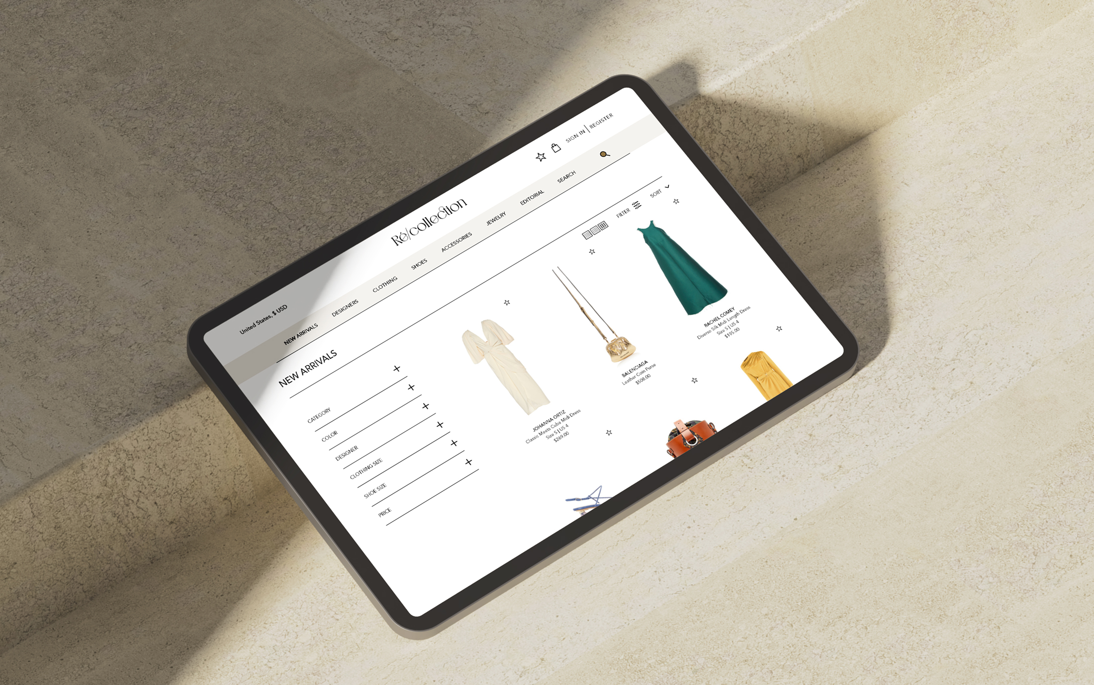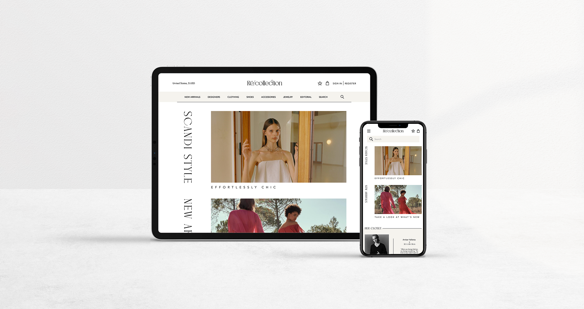

Luxury Consignment Ecommerce Concept
MY ROLE

Objective
The objective of the app is to help everyone find products quickly and easily to match their particular needs with basic navigation and clean design
WHO
People who want to shop for key items without going into a physical store
WHAT
A responsive website/web app/mobile app that shows users the inventory and can be filtered in particular ways depending on their needs
WHEN
On commutes to and from work, in the evening, during lunch breaks, and on weekends
WHERE
Anywhere they can connect to internet, whether on a mobile device or on a desktop
WHY
Users don't have the time or ability to visit physical stores and would rather buy their goods on the go or from home
User Stories
As a new customer, I want to access the inventory without having to register, so that I can make sure this store has what I'm looking for before having to create an account
As a customer, I want to have access to advanced filtering options, so that I don't have to browse through a lot of products to find what I'm looking for
As a customer, I want to shop somewhere with a flexible returns policy and good customer service, so that I can easily return what I do not want
As a frequent customer, I want to be able to save my favorite search criteria, so that I can easily find what is most relevant to me
As a frequent customer, I want to see recommendations of products I may like, so that I find items I might not otherwise on my own
As a returning customer, I want to be able to save items that I cannot buy to a wish list, so that I can purchase them at a later date
As a returning customer, I want to see an overview of my previous activity, so that I can view previous purchase and search history
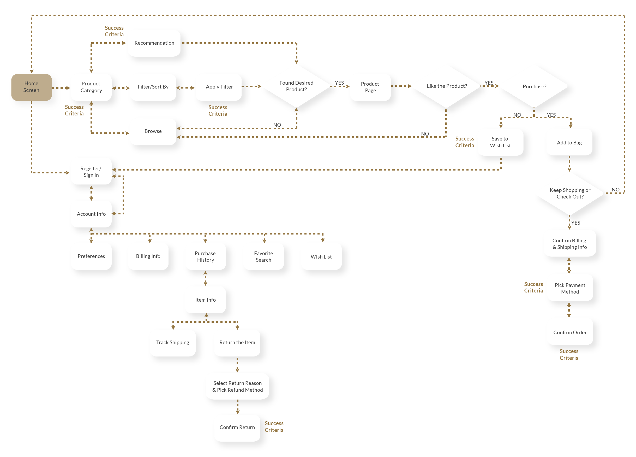
User Flow Diagram
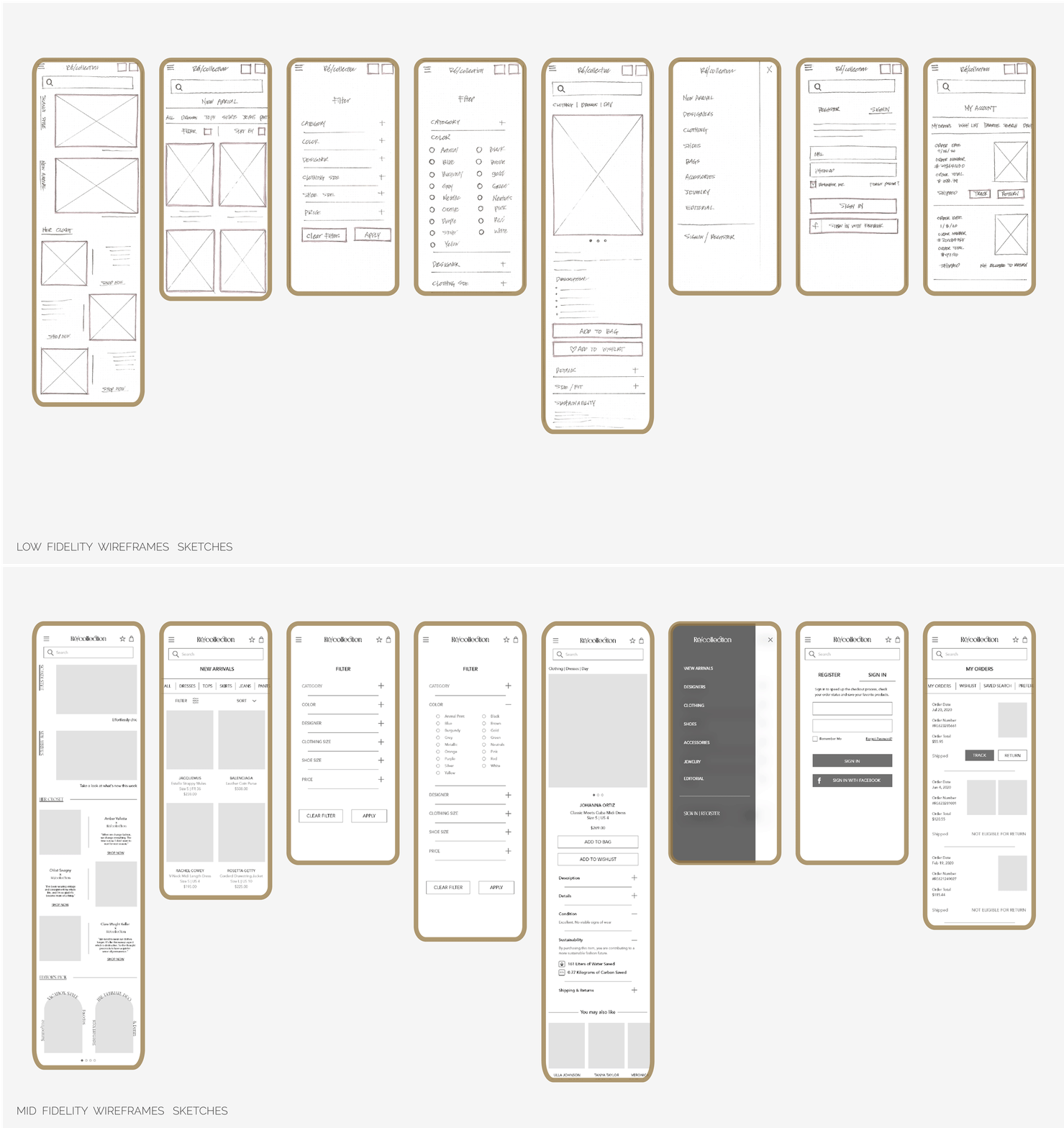
Wireframe
User Testing
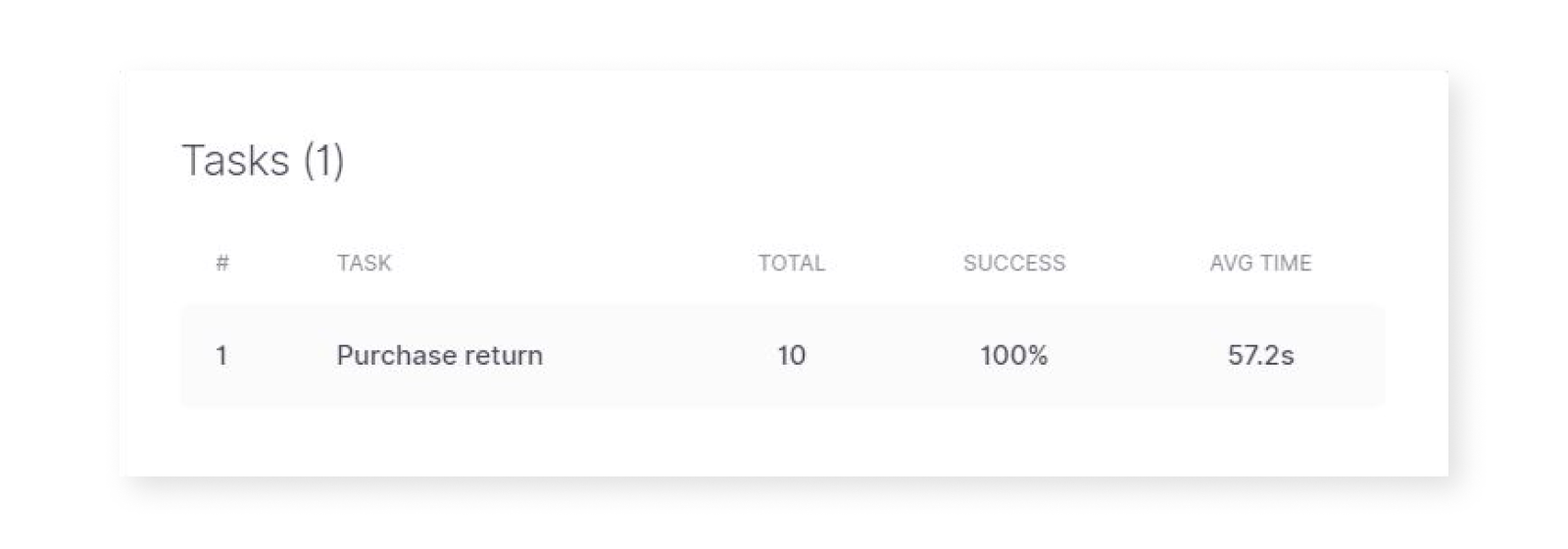
TASK 1 | Purchase Return
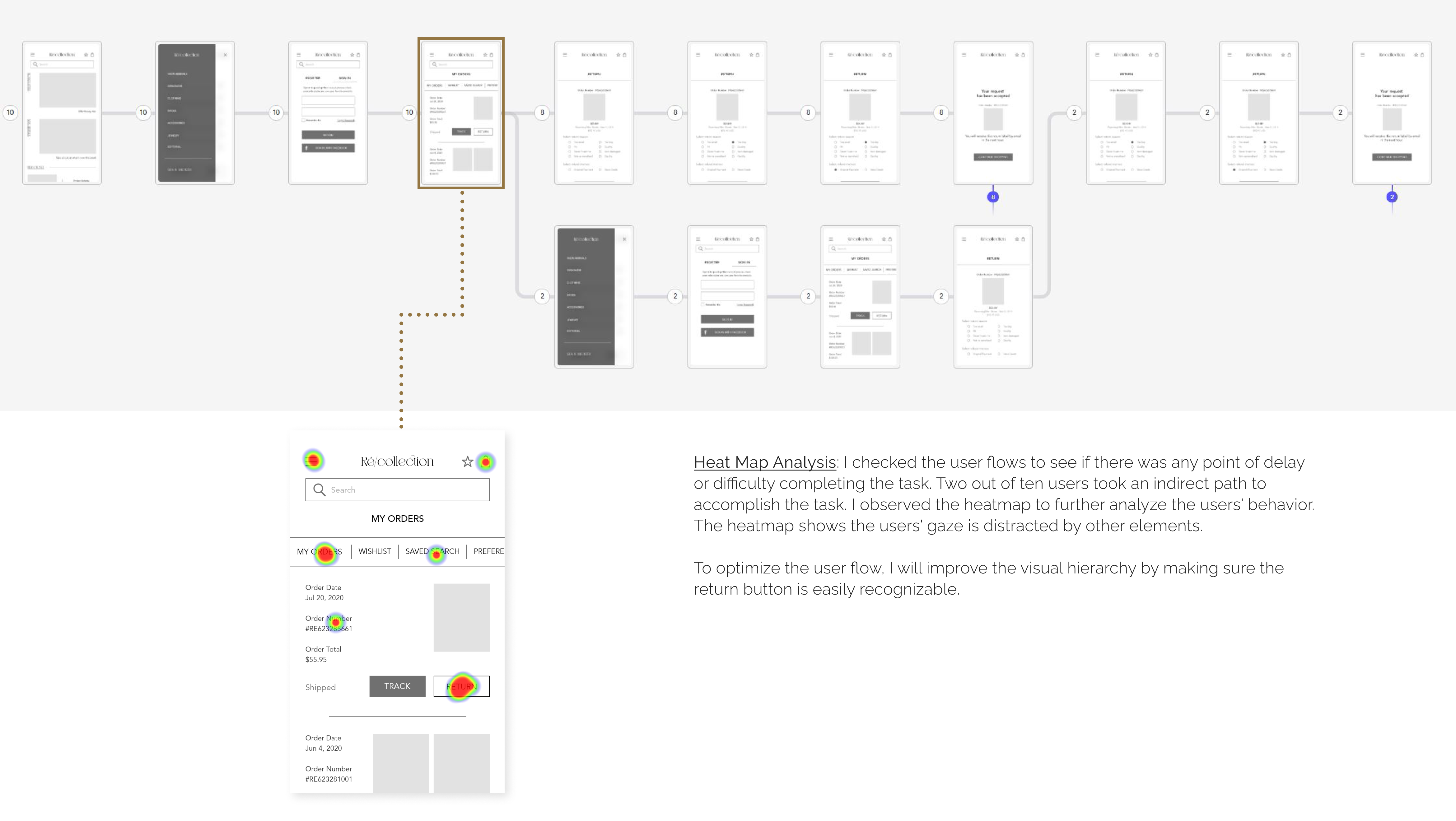
Task Instruction: Sign-in to get access to order history and return the latest purchase item. You are returning because the size of the item is too big and you want your refund to be credited back to the original payment method used.
Task Results:
TASK 2 | Save Search Criteria
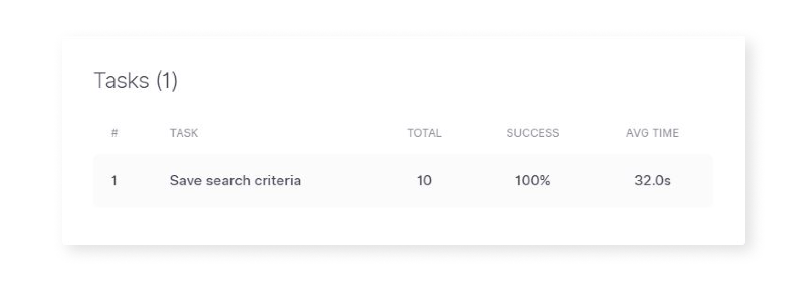
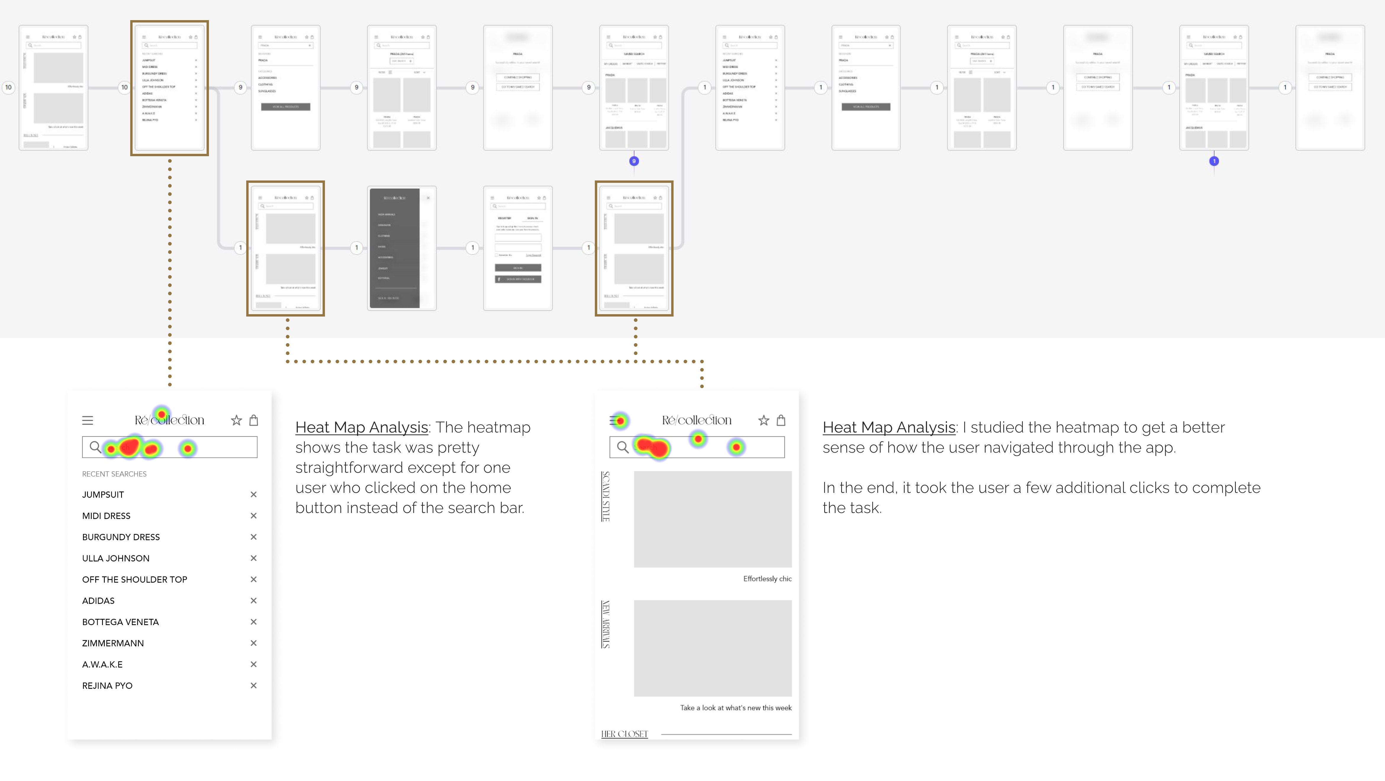
Task Instruction: Search for all items from Prada. Next, save this as your favorite search criteria
Task Results:
PAIN POINTS FROM USERS
"Save Search" button is confusing to me. You asked to save to Favorites and I was looking for the button that says "Add to Favorite" or something like this. Overall, the tasks were easy to complete.
One thing, I prefer when the sign-in is not hidden in the menu. I generally do not even consider using an app which forces me to register before I can even try it, but still, I feel that login/sign-up/guest should be the first thing after splash.
This is a mid-fidelity one that's why but I find it hard to read some fonts, otherwise, I like it simple and neat!
UX SOLUTIONS
- Consider changing "save search" to "add to favorite"
- Consider adding an account/sign-in icon to the top nav bar for easy access
- Increase the font size and character spacing to ensure the vertical font is legible
- Consider changing text orientation for better legibility
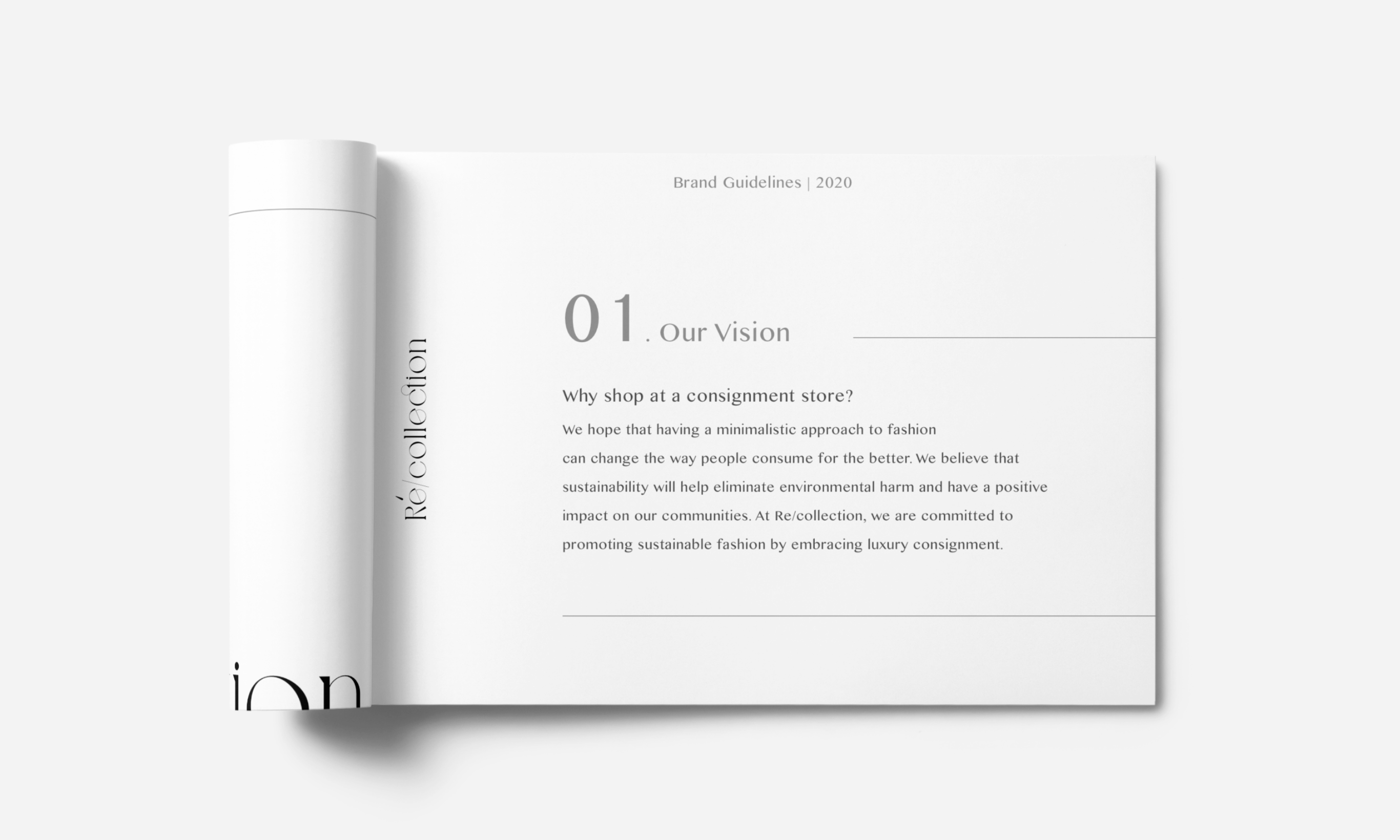
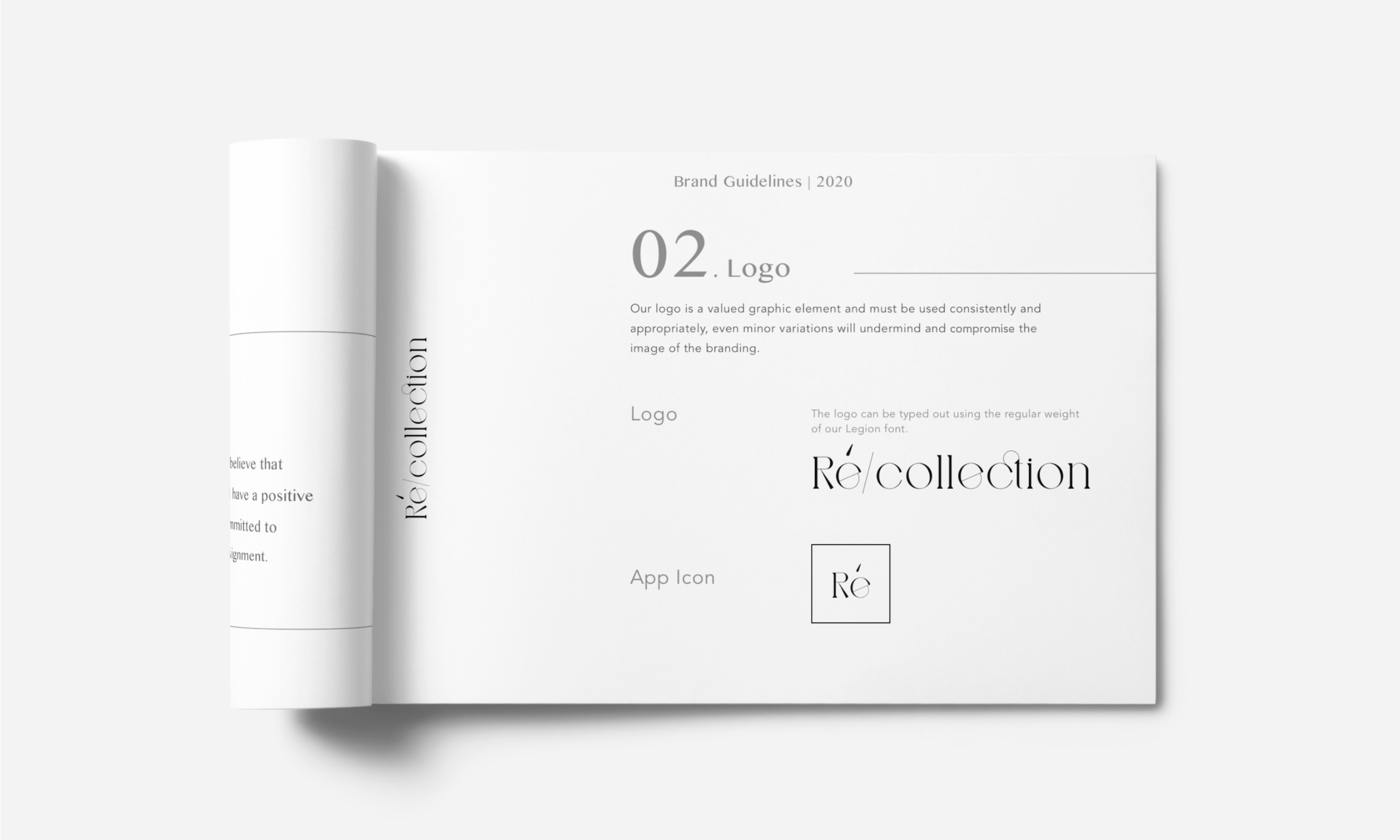
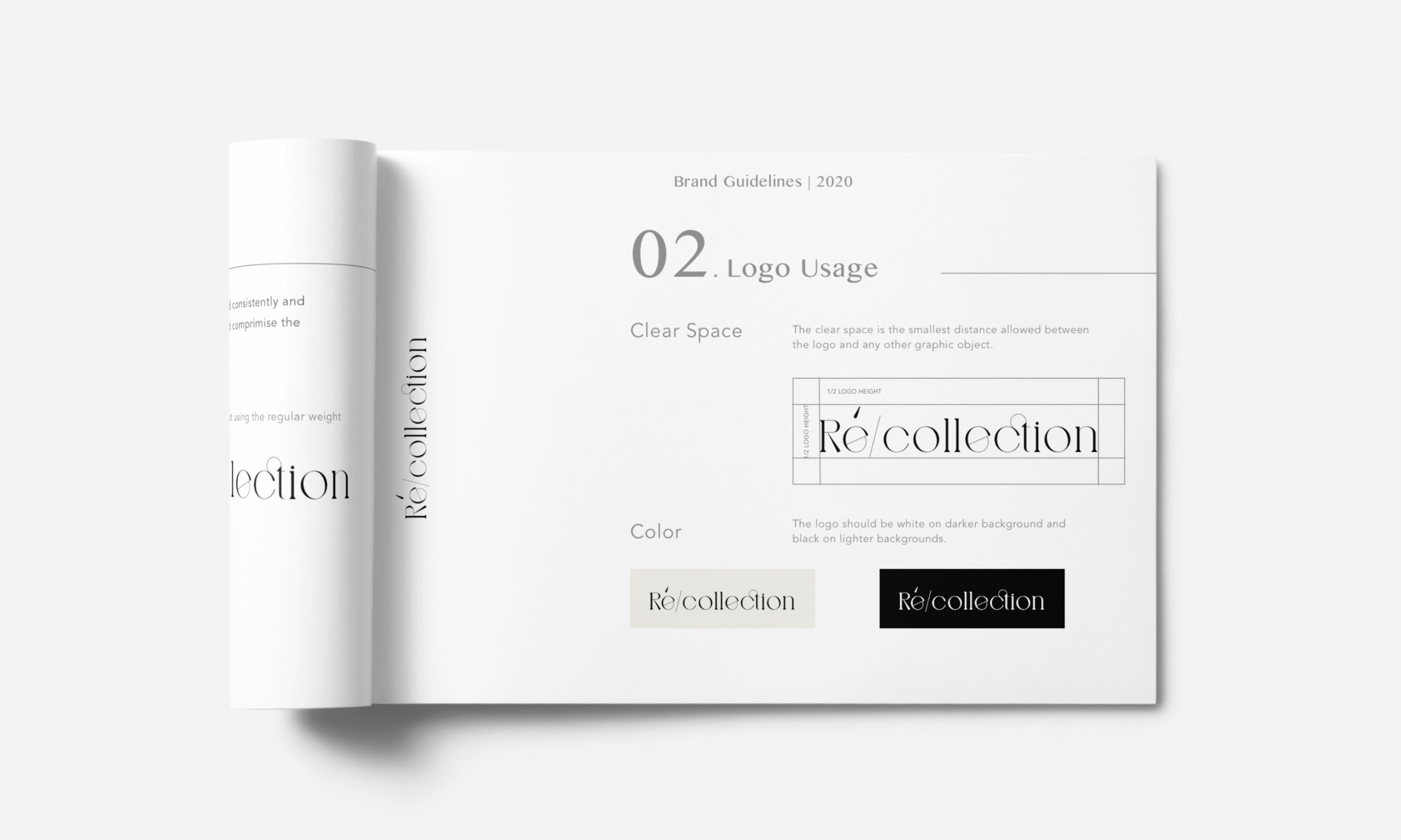
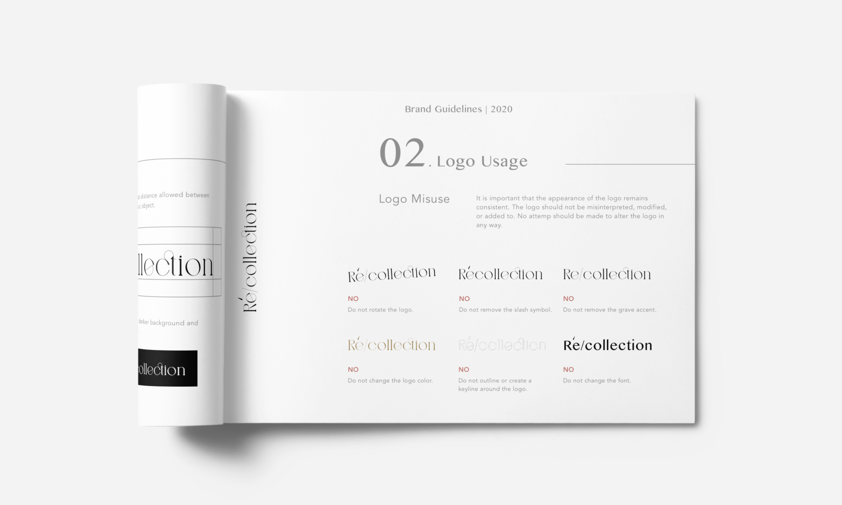
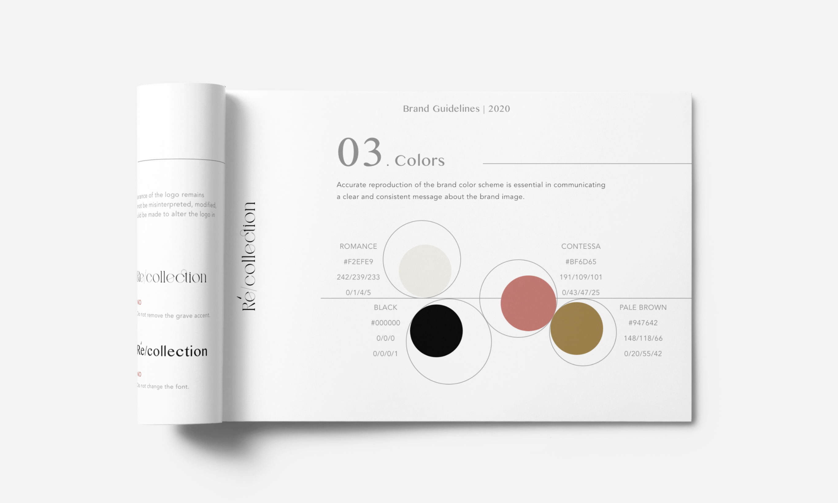
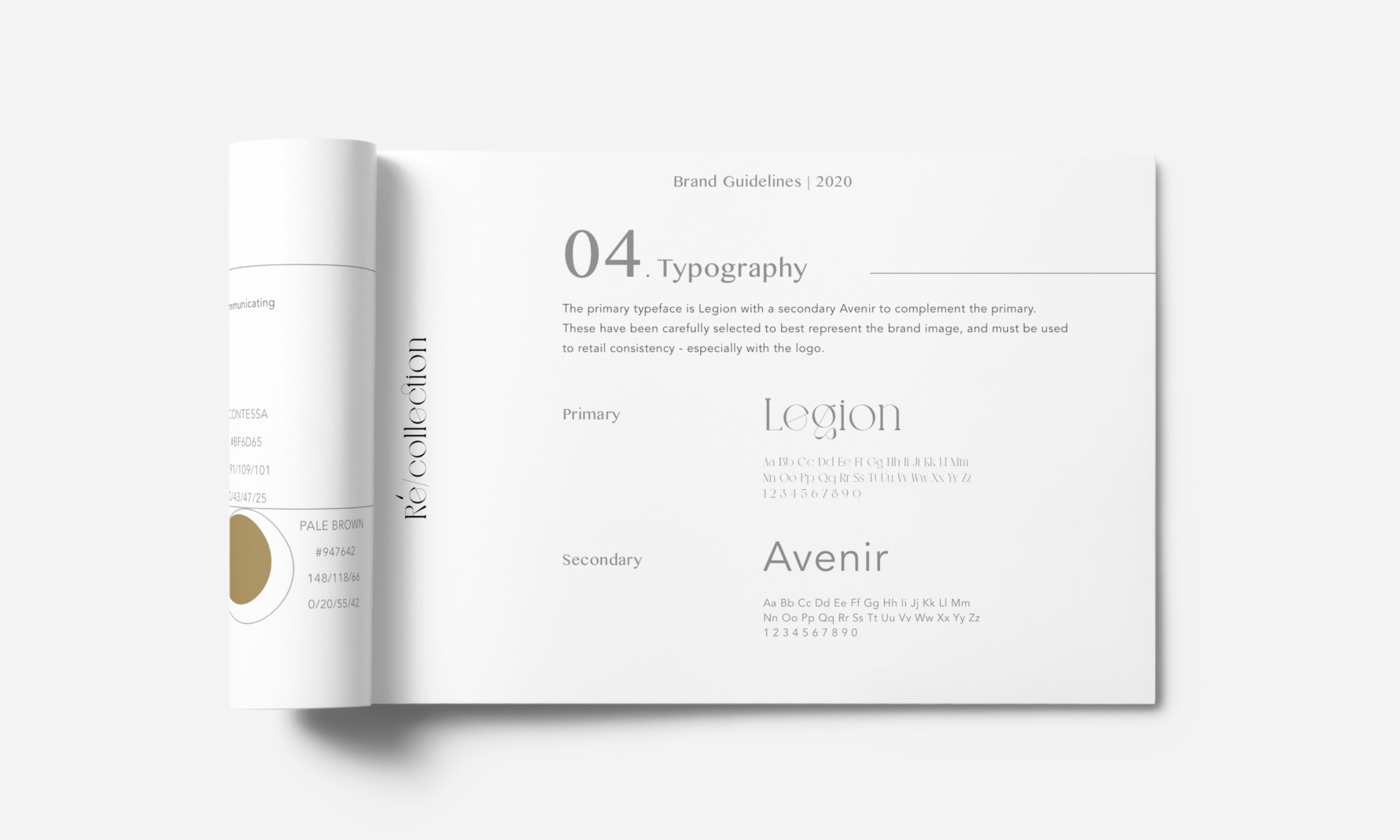
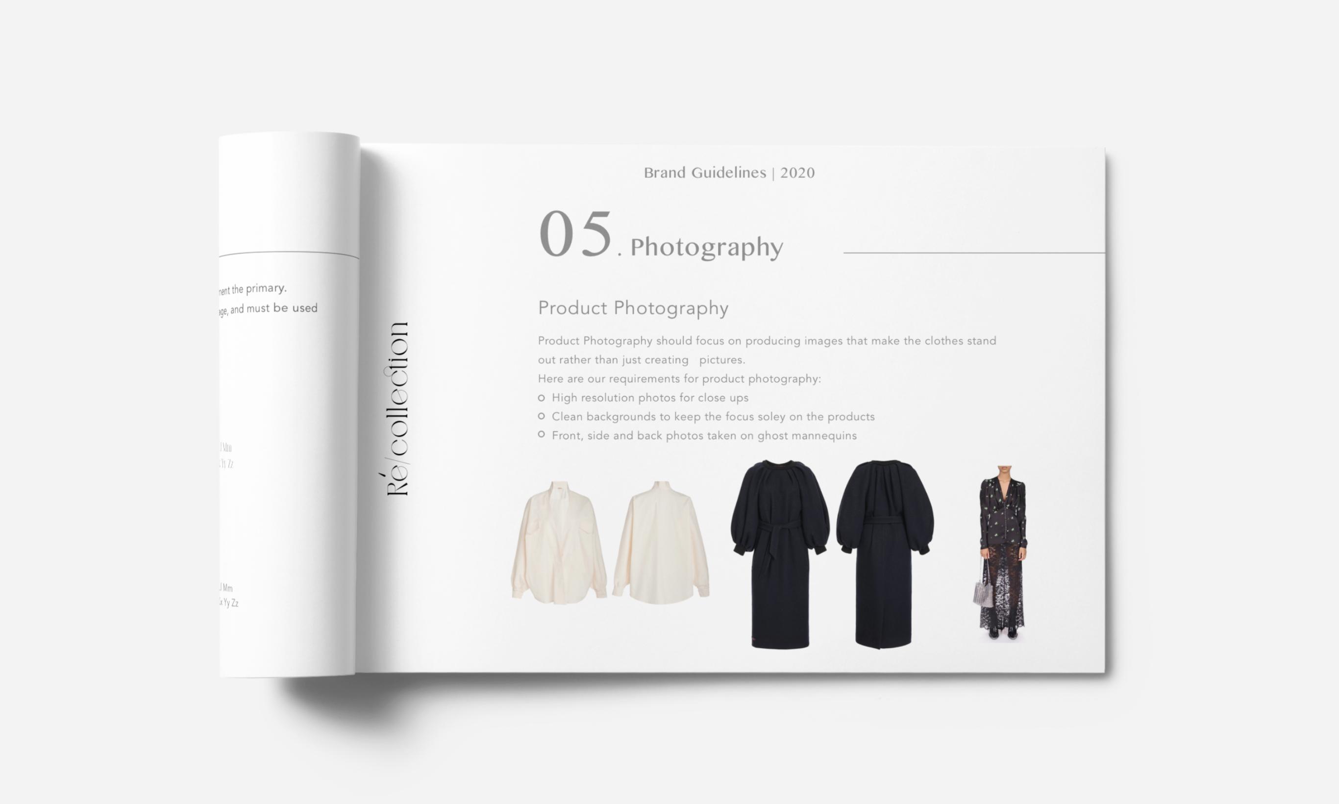
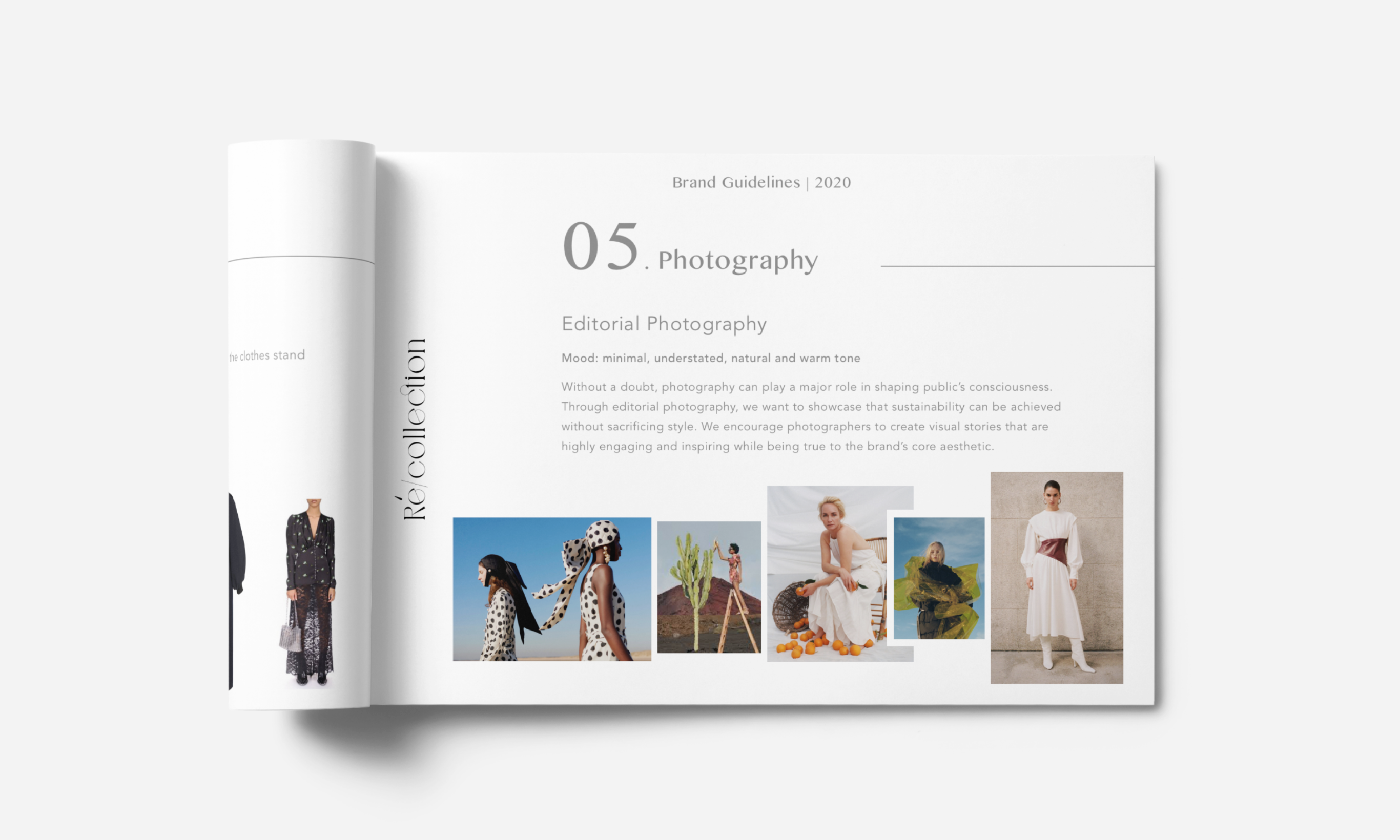
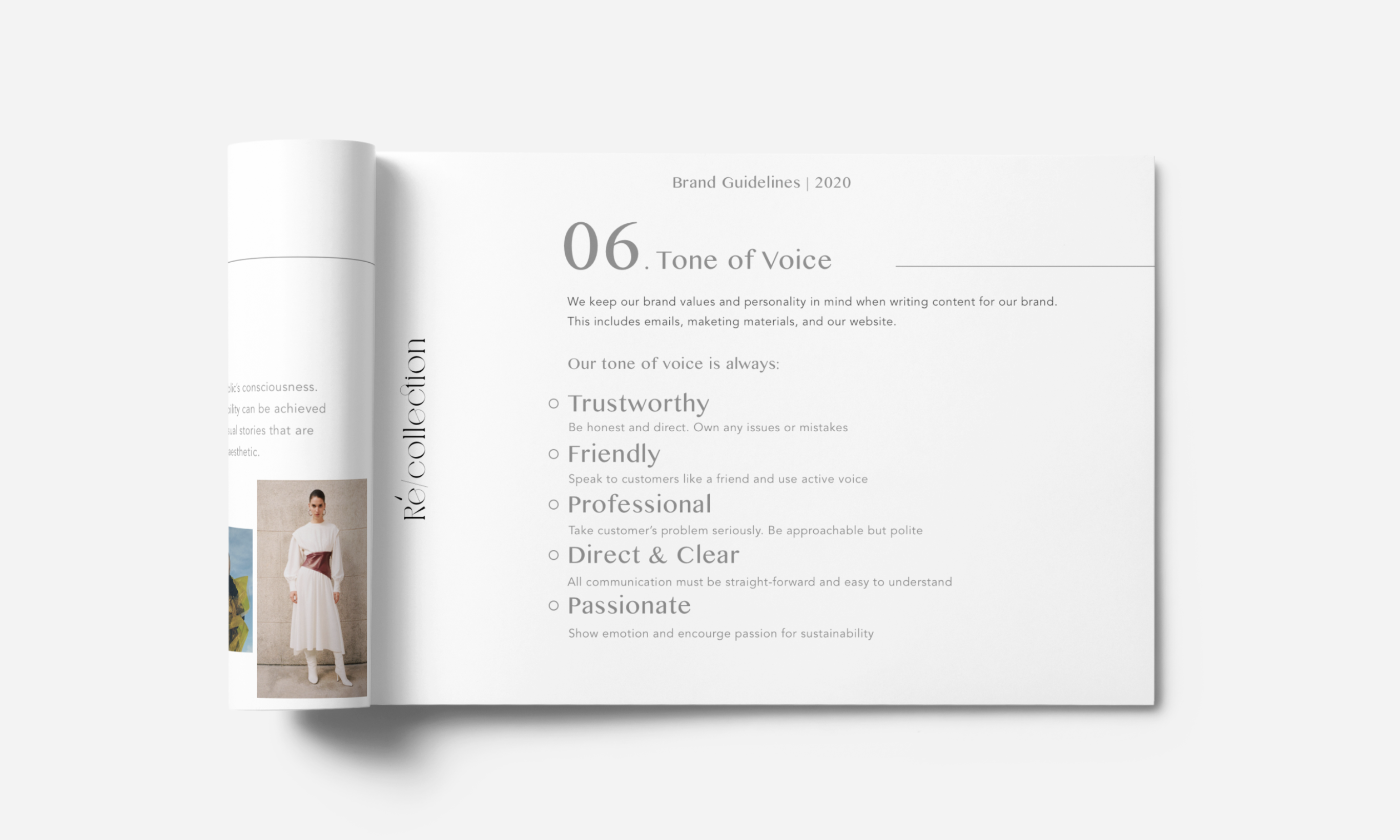
Brand Guideline
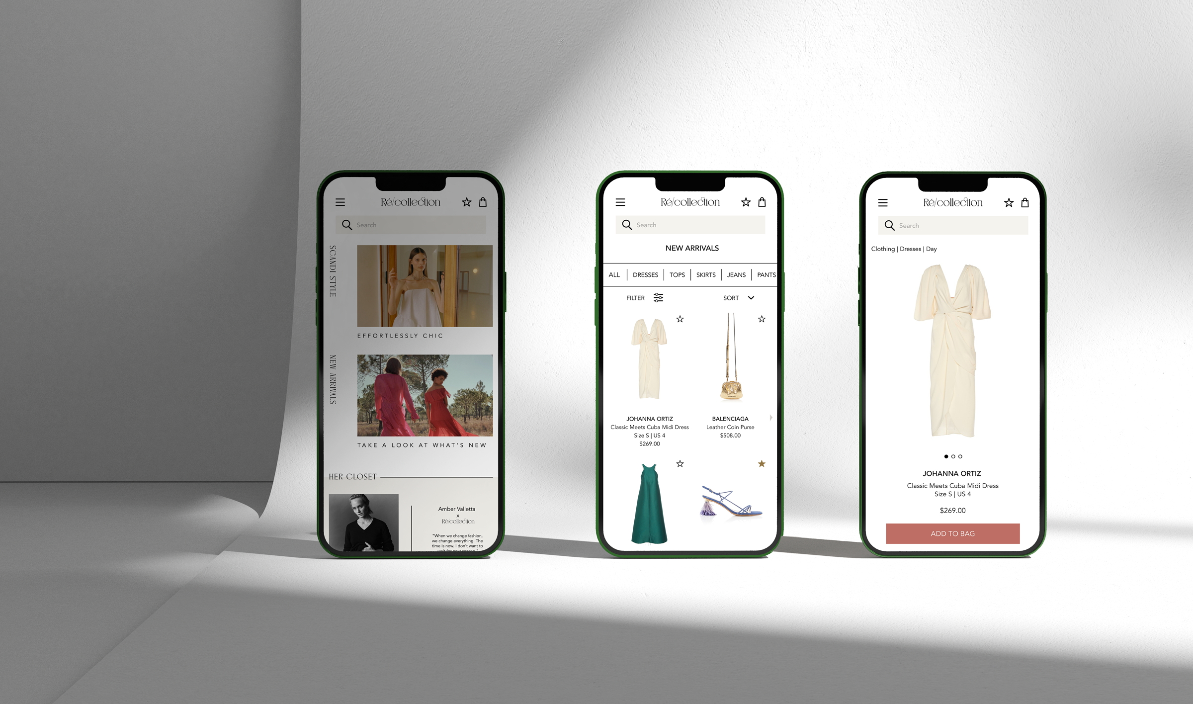
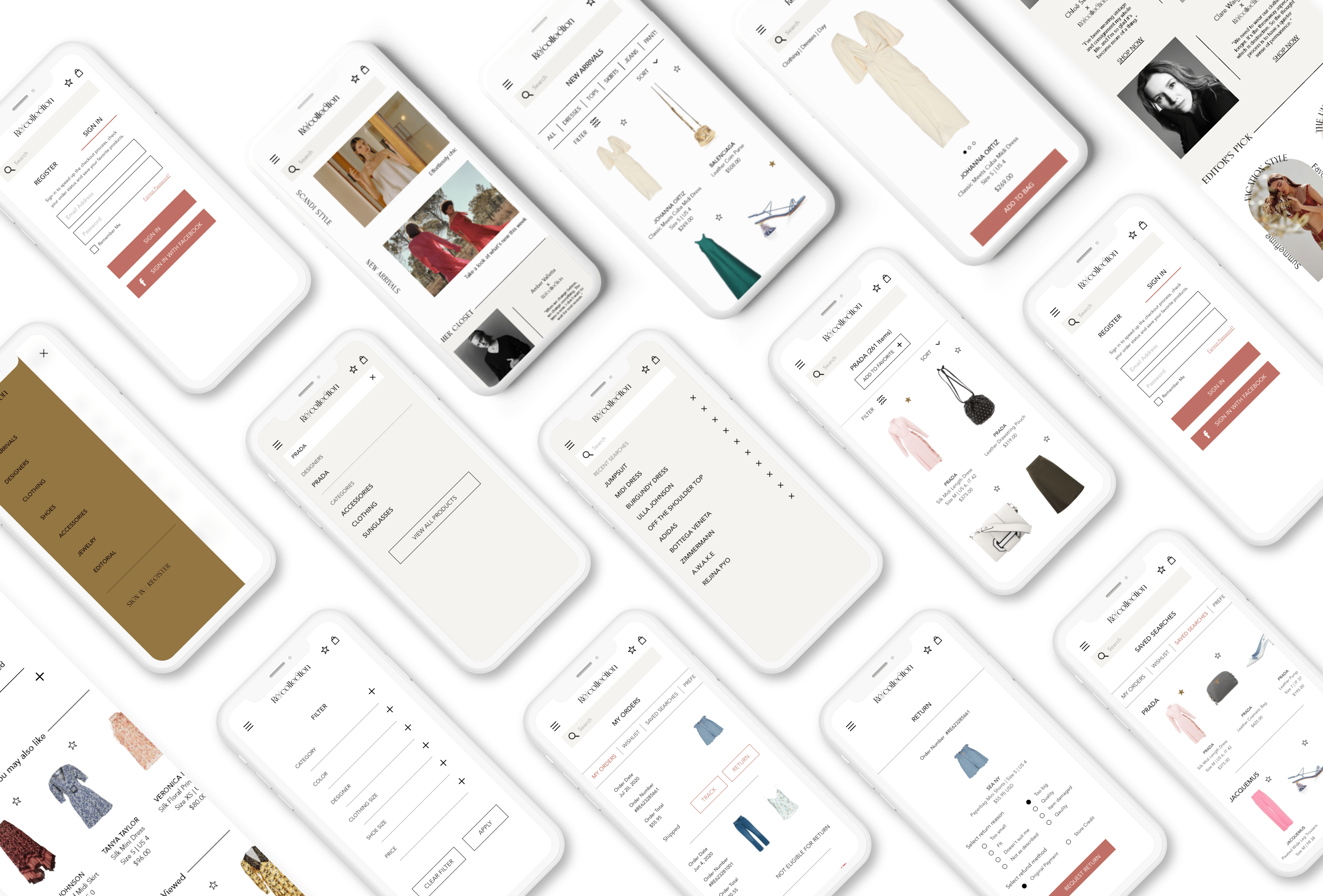
Mobile App Design
Website Final Design
